We're very pleased to turn our Back to Black-and-White feature over to Bernhard J Suess for the next series of articles on creating black and white photographs. As many of you may know, Bernhard's the author of two popular books on Black-and-White Photography: Mastering Black-and-White Photography: From Camera to Darkroom and Creative Black-and-White Photography: Advanced Camera and Darkroom Techniques both published by Allworth Press. We're also thrilled to announce that we're hard at work on a new Course on Black-and-White Photography based on the teachings, books and philosophy of Bernhard J Suess. Email us at Black-and-White Course to be on the list to find out about this Course as soon as it is available. Back to Black-and-White is in very capable hands, so sit back, relax and get ready to learn!
If you've missed any of the earlier installments of Back to Black-and-White, you can read them on our Techniques Reference Shelf.
Choosing Subjects for Black-and-White Photographs
"All the subjects for black-and-white photography have already been shot," the gallery director explained. I sat, staring, not sure whether to nod or ask how that could be. I was a young photographer, meeting with the director of a nationally known gallery and was less sure of my photography than I am today. The words are paraphrased, though the meeting is burned in my mind. My photographs had been rejected, and in none too gentle a manner. This is part of the process of being a photographer and I learned from it.
The subjects for black-and-white photography might seem limited. For example, traditional subjects include landscapes, portraits, still life and everyday scenes. You might even consider the broad subject of photojournalism as a single subject. Non-traditional subjects might include abstract and manipulated photos (these are non-digital techniques such as scratching, compositing, and so on).
The list would appear to be dreadfully short. In truth, these broad subjects branch off in myriad directions. A portrait, just to consider one of these, can be formal, candid, environmental, representative, and more. This does not even consider the different people to be photographed, lighting conditions, season, background, or the many elements which affect the final photograph. Consider for a moment that you've taken a portrait of your mother, father, spouse, child, or a friend. Do you believe that because that person has been photographed once, they are no longer a valid subject? Of course not. You'll see that we're trying to categorize photographs, using words to describe something we see. This categorization can lead to a lot of frustration and is an effort in futility, at best.
Last time we discussed how to see in black-and-white to and, more precisely, how to compose a photograph. But knowing how to compose and what to photograph are two very different problems. When someone questions your photographs, whether subject matter or technical qualities, it can lead to self doubt. In turn, that can cause lack of confidence and a change in your photography that you may not be pleased with.
Beginning photographers are the most pliable when it comes to outside influences. They are typically still searching for a style, honing their skills, and unsure of their abilities. For that reason beginning photographers are more easily taught than those with some experience. Unfortunately, neophytes are more likely to copy or follow influences they don't understand - sometimes without questioning or looking for their own paths. Make no mistake, there is nothing wrong with learning from others, whether through discussion or viewing their work. It only becomes a problem when the advice is followed blindly.
For these reasons and others, many photographers have a difficult time choosing appropriate subjects for their photography. When I taught photography, it was not unusual for students to show me a photograph in which they could not tell me the subject.
If we look back at photography, we'll see that in the early days, the subjects chosen for black and white photographs were often similar to those painters dealt with. In many ways, early photography was a direct descendant (aesthetically) of painting. Landscapes, portraits, everyday scenes, and still lifes were common choices. In fact, many painters derided photographers for taking their subjects and, seemingly, doing a better job. Photographers could create images with great detail in much less time than painters could. Some painters even mourned the death of painting, which we now know was a premature conclusion.
Early photography also had some technical constraints. For example, it was not possible to take photos that would stop any sort of action. With exposures lasting several minutes or longer, any motion would be rendered as a blur. People had to pose for many minutes as a plate was exposed and therefore often looked stiff in pictures. On the other hand, it allowed photographers to see subjects like flowing water in a way painters never had.
The development of photography allowed painters to move away from their previous subjects, which were mainly lifelike renditions, to abstractions that few had considered before. So, as photography took over painting's previous subjects, painters expanded their aesthetics. The classic subjects of early photography and painting are still with us today. Whether photographing people, things, or places, most photographers begin with realistic renditions of things around them.
Especially for beginning photographers, that is usually the best place to start. I often had students complain there were no subjects. "There's nothing interesting to photograph," was a common refrain. I advised them to take pictures of things they like, whether they seemed interesting or not. I've found that when we're photographing subjects in which we're interested we are more likely to look for a good image.
Beginners often photograph their subjects literally. There's nothing wrong with that. Many times, though, an ordinary subject can be made extraordinary. That is rarely due to the subject and almost always a reflection of the photographer. Extraordinary photographers do not see their subjects only literally.
If you remember, previously we discussed that most viewers like dynamic photographs. To make a dynamic photograph, you must see the shapes, lines, and tones that make up a black-and-white photograph. In a sense, the photographer learns to break down the subject to its basic compositional elements then builds an image from them. Of course, this is an oversimplification of the process. Perhaps a few examples might help.
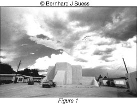
One photo in which everything just "clicked" was of the church in Taos, New Mexico. It was my first visit to Taos and I went to see the church I'd heard of, located in nearby Ranchos de Taos. I could not find the preconceived shot I expected to find when I arrived. At the time, it seemed that an overall shot would show the church and its surroundings. But there were distractions and the composition would not have been very strong, in any case (see Fig. 1).
It was only after walking around the church that I found the perfect composition (see Fig. 2). The late afternoon sun created strong shadows that added to the dimensionality of the portion of the church I chose to photograph. The placement of the shadows looks planned, but it is pure luck. There is a repetition of shape caused by the shadows. The three shadow areas of the photograph, in the upper left corner, the middle, and the lower right corner help to move the eye through the photo (see Fig. 3). Cover any one of the shadow areas with your hand and see how much less effective the composition is.
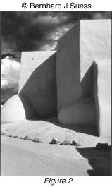
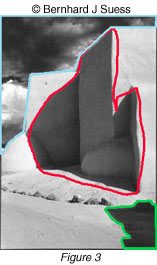
This was one of the first photographs in which I realized how strong lines and shapes can add significantly to an image. In fact, as I excitedly made this photograph, I realized I was no longer shooting "the church." I was shooting lines, shapes, and their relationships. The epiphany was overwhelming. I'd had glimpses of the graphic elements of which subjects are made, but this was the first time it had worked so well. I'm still proud of this image. I have since seen many images of the same church-I had not known it was so popular with photographers-many shot by well known photographers. I'm biased, but I still prefer my composition.
Note that, in spite of my desire for technical perfection, I haven't mentioned the exposure, development, or printing details. In this discussion, those are merely secondary. When we talk about the aesthetics, including how to choose and compose a subject, I presume that you are capable of getting the tones you desire. Certainly the tonality of the black and white photograph, especially one with such important shadows areas, is critical to me. However, that is a totally separate issue.
Another example is a photograph I took during my first visit to Baring Falls in Glacier National Park. This time, with no preconceptions, I tried several different angles. The composition that worked best for me was one of the simplest (see Fig. 4). There are two main lines in the photograph, which follow the flow of the water. These two lines are enhanced by the blur of the water. Again, the exact technique is not so important as the ability to photograph the visual elements desired to make up the composition.
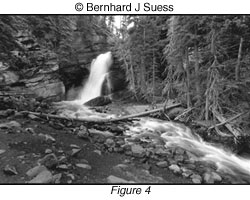
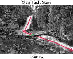
A more subtle compositional element is the tree across the stream. This line stops the primary line, making the eye explore that area before moving on with the flow of the stream (see Fig. 5). There are, of course, many other lines and shapes in the photo, but none of them are nearly as important in the composition. All the visual elements play a part-the textures of the trees behind and rocks in front play off the smoothness of the stream nicely-but the main lines carry the most weight in the photo.
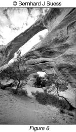
In Arches National Park, on my fourth visit to Double O Arch, I wanted to try something different. I was happy with an earlier photo (see Fig. 6), which captured a sense of the size of the arch. This is also what most visitors see as they approach the arch by the most used route. On this visit, I decided to hike over to the other side of the arch. I'd been there before. The view is surprisingly dissimilar. It looks like a completely different arch.

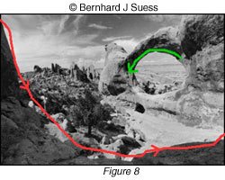
This time I was fortunate that the mid-afternoon sun threw a shadow in the foreground. That shadow helped to "close in" the composition (see Fig. 7). Notice how the arc of the shadow also continues along the top of the arch itself (see Fig. 8). It's this visual motion that I was looking for in the composition. The canyons and the sky in the distance play off the main composition and are certainly preferable to a plain, level background. They are not the main components of this photograph, however.
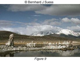
While shooting at Mono Lake, I was taken by the fantastic nature of the scene. Due to the loss of water in the lake, the level was dropping and amazing underwater formations called tufas were revealed. I shot a few color photographs, using a telephoto lens to draw in the distant mountains (see Fig. 9). While it's a nice photograph, it's more of a postcard type photo than I'd prefer. That is, it records the beauty of the place, but does not necessarily use the lines and shapes of visual elements. I decided to shoot some black-and-white photographs.
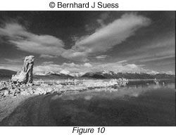
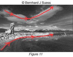
As I walked along, I was intrigued by the curve of the shoreline. Clouds began to move over the scene, mirroring the curve of the shore. I looked for a composition to use the mountains in the background (repeating the shapes of the tufas and other growths from the lake) (see Fig. 10). The tufa along the left side of the photo helps to anchor the composition in place. It gives the eye a place to rest as it follows the opposing curves (see Fig. 11). As spectacular as the scene is, it's still the lines, shapes, and curves that move the eye through the photo.
If you can begin to look at your compositions as visual elements, rather than merely literal subjects, you will go a long way towards taking photographs to be proud of. Remembering that photographic images are made of tone, shapes, and lines and their relationships will make it easier for you to find a good composition, no matter what the subject. And you'll know that even old subjects can be shot anew, no matter who tells you differently.
Black and White photography can sometimes be tricky, come learn more about it in one of our Photography classes


