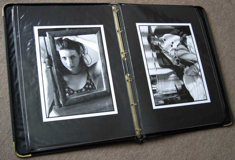
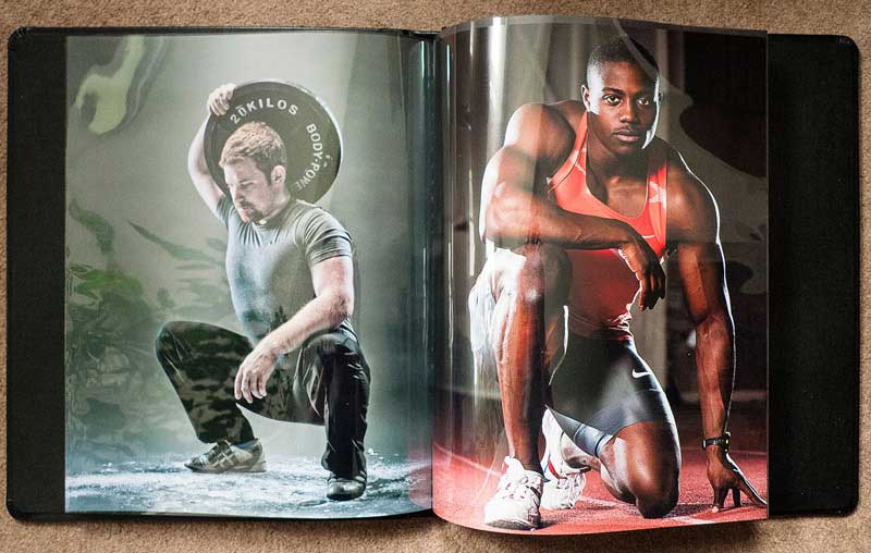
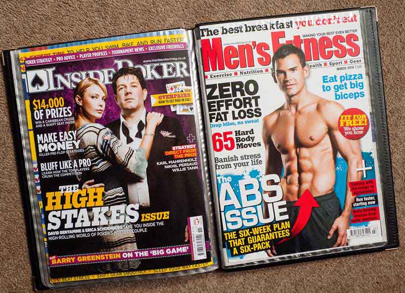
Creating a portfolio of your work is a vital first step for aspiring professional photographers, and it's also a worthwhile exercise for keen amateurs. In this post, when I talk about "the portfolio," I'm not just referring to a traditional printed portfolio, but your body of work and how it is presented. So this could just as easily mean your website, your Behance or Flickr profile, and even your business cards. Before you spend lots of time and money putting a portfolio together, here are a few things to think about.
Don't Show Rubbish
Way back in the dawn of time (something like 1995) when I was applying to college to study photography full time, I took the portfolio I'd made for the interview to a local professional commercial photographer for him to cast his eye over and offer me feedback. I'd laboured and slaved over these eight pictures, printing in my darkroom (Mum and Dad's outside toilet) for many hours, having already spent a great deal of time shooting the images in the first place. As I was showing him the work, I kept explaining shots and saying things like, "I couldn't quite shoot this one how I wanted; this one isn't printed right; I didn't have a flash on that shoot," and so on. After a while he simply put the portfolio down and said to me, "Stop making excuses. Why are you showing me this if it isn't the very best work you can do? Don't show me rubbish — show me the very best you've got, and if that means only two pictures, so be it. People will remember you for the rubbish shots and your excuses, so get rid of them!"

Are you ready to show your photography portfolio to paying clients?
I left with my tail somewhat between my legs and a slightly sick feeling in my stomach — the college interview was less than a week away, and now I felt totally unprepared. However, you'll be glad to hear I got into college (mostly through thinking on my feet in the interview, but that's another story), and the ruthless editing lesson he taught me has stuck with me to this day. So, Rule #1 of putting together a portfolio of work is: Don't show your rubbish.
Research Your Market
Before you start to narrow down your selection of images, the first thing you must spend some time and thought on is market research. What sort of images are your potential clients looking for? At a very basic level, if you're marketing yourself as a wedding photographer, there's not a lot of point showing off your baseball shots, and so on. Beyond this, it's worth looking into how best to show your work. Do you need a printed portfolio of some sort, or will a website be sufficient? You may well need both, as well as an iPad or similar tablet, business cards, postcards, and the whole panoply of printed material. In my job as an editorial and commercial photographer, I need the whole range. Although a client may well find me via my website, a printed portfolio makes more impact during a face-to-face meeting, and a tablet allows me to bring along lots of supporting images that can back up my work.

Creating a Body of Work
Different markets demand different things, but unless you're a general-purpose photographer, making your living from a bit of this and a bit of that, it's important to focus the work in your portfolio and be selective about what you show. If your portfolio contains eleven images of corporate headshots and one image of your son in fancy dress, the fancy dress shot is going to look a little odd — no matter how outstanding the photo is. When a client looks through your portfolio, they'll be looking for consistency and a reassurance that if they book you for a specific shoot that you'll deliver the images they're after. Having a consistent "look" will help hugely in this, and if you find yourself covering a very wide range of work, then use different galleries on your website and get more than one portfolio printed.

A Few Basic Website Rules
No matter what your market or the work you shoot, there are several common things that all photographers should be doing on their website to ensure their work gets seen and that potential clients leave with a good impression:
- Do not include music. You are not a musician; you are a photographer. Music will almost certainly detract from your work rather than add to it.
- Make sure the site loads quickly.
- Don't have lots of automated stuff starting up as soon as someone navigates to the home page.
- Check the site design on as many different browsers and devices as possible. What works on your big monitor at home on Firefox may look awful on a tablet running Safari.
- Make sure the site can be navigated easily. Don't make the design so clever that people have to spend five minutes trying to track down your contact information.
The Overall Package
Whichever method you focus on, bear in mind that your whole appearance as a photographer will create an impression on a potential client. Your behaviour during a portfolio viewing, your responses to emails, your business cards and other business stationery — all of this will contribute to how likely you are to get commissioned.
If at all possible you should make every effort to get a second (and third and fourth) opinion about the work you're including in your portfolio. Ideally these opinions will be from people who know something about the market you're trying to crack into, as they'll be best placed to give you relevant objective insight. Beware of trusting what loved ones and friends say — they're unlikely to want to offend you. Similarly, be careful of getting too close to your own work. I can think of several occasions where I should have removed something from my portfolio, but because the work in question had either taken me a great deal of effort to shoot or had significant meaning for me, I left it in far too long! If in doubt, refer to Rule #1 above!

Bonus: If you want to learn more about photography and taking better photos, try a photography course from NYIP today! Request your free photo course catalog here.


