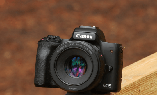
Photo by NYIP Graduate Cathy Quinte

When photography was in its infancy (1839 or thereabouts) people were amazed by the realism the camera delivered. Why, there's Cousin Nell when she came to visit us in Omaha! Looks just like her, doesn't it? And there's Uncle Arthur, the year the tractor ran over his foot. It was the left one, see how flat it was compared to the other one.
The point is that photography produced realistic interpretations with much more detail than painters could produce on canvas. The viewing public was astounded, and well they should have been. That is, until the novelty of realism wore off, and we tired of seemingly endless genre studies in page after page of family albums, in countless stereopticon slides, etc.
In the latter part of the 19th century the great French painter, Paul Cezanne (and others) experimented with showing subjects from several different points of views. Not necessarily with different pictures but showing different points of views of the same subject in a single picture. In other words, realism, per se, was not the only objective. To such artists as Cezanne, linear perspective and a single point of view was less interesting visually and less challenging intellectually than the possibility of viewing something at the same time but from different vantage points.
Photographers quickly realized that they, too, could do the same thing as Cezanne but with faster (read easier) methods. Multiple images, montage, collages, print manipulation — all manner of artificial devices designed to make the photograph not a demonstration of realistic interpretation but rather an imitation of the new style of painting that Paul Cezanne introduced.
This type of pictorialism, not the only type by any means, prevails to this day. Rather than the stark realism of a Lisette Model or Dorothea Lange we see the fanciful images of a Joel-Peter Witkin or a Frederick Sommer.
NYIP Graduate Cathy Quinte of Thunder Bay, Ontario, Canada, has created our Picture of the Month, an arresting multiple image in the pictorial manner.

At first glance one sees a camera whose diaphragm ring frames the dark luminous eye of a beautiful young woman. Our own eye moves downward, taking in the rest of her waiflike face. She resembles Liza Minelli, a bit like Audrey Hepburn, too, and even a hint of the great Edith Piaf (the late French chanteuse).
There are additional overlappings of images but are perhaps too confusing to identify. That is one of the wonders of photographs involving montage, namely, all is seldom fully revealed, thus leaving the viewer's imagination to fill in the gaps.
Montage of this sort may not be everyone's cup of tea. Some people want everything clear and explicable and with no sense of mystery. And yet Cartier-Bresson worked in a straightforward manner, but his pictures, nonetheless, often have a highly surrealistic feeling (without any use of montage effects). In other words, the photographer may challenge the viewer and yet use no obvious stylistic methods.
This only goes to show that photography is broad enough, diverse enough, to embrace all kinds of approaches and without prejudice.
No doubt you will recall the three NYI Guidelines, and let's see what Cathy Quinte did in that respect.
The human imagination is an extraordinarily complex topic, filling quite easily our concept of "strong subject material". But as a character in Gone With the Wind says: "wishin' ain't gettin'." Simply making the photograph a complex one does not automatically make it clear. It is not enough to pile image upon image in multiple layers; one still must maintain clarity. Your viewers still have to be able to get meaning from the photograph despite its inherent mysterious nature.
The second NYIP Guideline asks us to focus attention on the subject, and this is intimately tied in with the third NYIP Guideline: simplify the picture. The photographer must decide how much to put in her montage but at the same time make certain that not too much is included. In a sense, the montage is like a table top arrangement. Too few objects, and the viewer is stretching, mightily, to find meaning in the arrangement. Too many things, and the viewer is so overwhelmed that confusion reigns, and any semblance of meaning is hopelessly obscured. We feel that the photographer, Cathy Quinte, has succeeded admirably well in this respect.
So what does her photograph mean? Well, one thing to me, and perhaps another thing to someone else. And yet still something else to Aunt Tillie in Cedar Rapids. That's what imagination is — something for almost every one. And maybe nothing for some.


