We've all been there and done it, and I'm not ashamed to admit to having done it myself many times. You think to yourself, "Shallow depth of field with ring flash, that's the answer. That's what my work needs." And then out you go and do a whole job using that approach, and wonder why the shots look lovely but feel rubbish. Usually this is because there's nothing actually in them, and all you've been doing is a technical exercise.
A film director doesn't generally start a movie by thinking "What I want is a really good shot under fluorescent light" and somehow try and hang a story around it. They start with a story and use the techniques of film to tell the story. Just because you've got a ring flash does not mean you have to use it.
Think of techniques as tools — you pick the right one for the job, and the more you know, the wider variety of jobs and situations you can handle. To continue the analogy, you wouldn't use a wrench to hammer in a rawl plug, any more than you'd use a hammer to tighten a nut. Likewise, there's a time and a place for moody dramatic lighting, and a time to break out the softboxes and the reflectors. In the same vein, adding a lens flare in Photoshop or whacking the high-pass filter to full power can sometimes be very effective, but let's be honest — we don't need to see it on every shot.
Rules are made to be broken, of course, and we all know that sometimes using an inappropriate tool can yield superb results. The secret lies in knowing when you can muck about and when you need to play safe, and although I'd love to provide a quick cheat for knowing when this is, the simple truth is there's no substitute for experience.
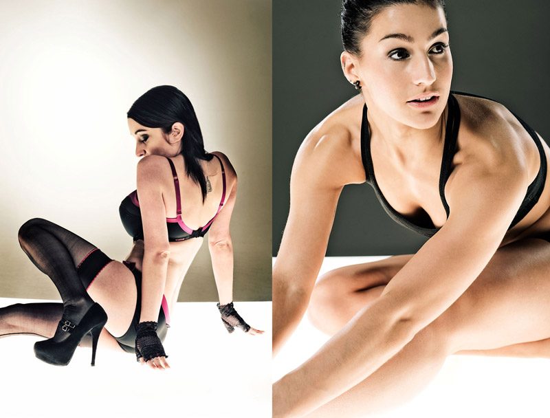
Now, there's no harm in shooting for purely technical ends; that's how we broaden our skill base and make our toolbox bigger. However, I'd suggest that you shoot specifically with this in mind, rather than being led by it. Personally I often shoot what I call "technical tests," which I use to simply refine new lighting approaches, equipment, Photoshop effects and so on. Occasionally the results from the shoot are outstanding, but generally they simply demonstrate how best to use something (or occasionally how not to), and the finished shots don't end up in the portfolio. However, when it comes to the next job, I've got another technique in my back pocket, which I can employ as required.
Technique (and technical methods) should be almost completely invisible, certainly as far as your subject is concerned. (I'm assuming your subject is human here — still life objects don't tend to care either way!) If you spend most of your shoot faffing about with lights, settings and so on, you'll almost certainly lose any connection to the person in front of the camera, and it will only be the most professional model or outstanding extrovert who still has something to give when you come to actually take the shot. Practice your craft, ideally with patient subjects, inanimate objects, household pets or someone who owes you a favour. Make it second nature, take copious notes you can refer to later, and then when it comes to the "real thing," you'll glide along quite happily and be able to concentrate on what you want your picture to say, rather than what f-stop you're at.
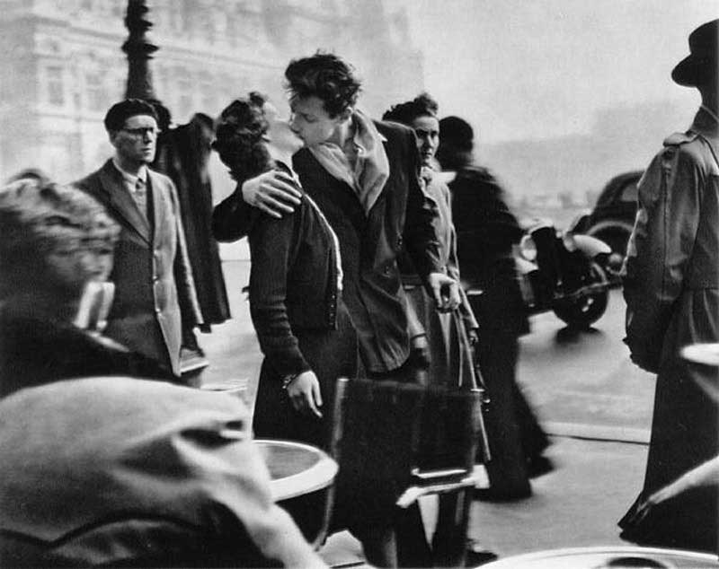
Many of the most famous photographs in history are technically flawed in one way or other, but that doesn't detract from their impact. I doubt many people (except true photo geeks) would look at a shot like Robert Doisneau's "The Kiss in Front of the Hotel de Ville" and think, "Oh it's a bit grainy and soft, and it's only in black and white. What that needs is good bit of high-pass filter and a lens flare." Remember that photography is about communicating ideas and emotions, rather than just an excuse to show off the latest kit you've bought.
Bonus: If you want to learn more about photography and taking better photos, try a photography course from NYIP today! Request your free photo course catalog here.


