When you’re shooting products, the obvious goal is the make them look appealing enough that people want to buy. But considering that people who shop from photographs can’t actually touch the products, we can also say that a good product shot has to help a buyer understand how the product might fit into his or her life.
Photo styling is obviously a big subject, but there are a few simple tricks you can employ in any small-product shoot to help the products look more useful and valuable. And you can often use these ideas without needing to invest in models or props.
Trick #1: Where is the product used most?
First, think about what kinds of environments your product is most at home in. Kitchenware, of course, is a natural in kitchens. A journal or tablet computer might be at home on a desk or in a coffee shop. A plant stake belongs in a garden or on a patio. Simply placing your product in its “native soil” creates the impression that it’s in use, and therefore, useful.
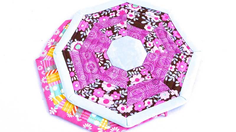
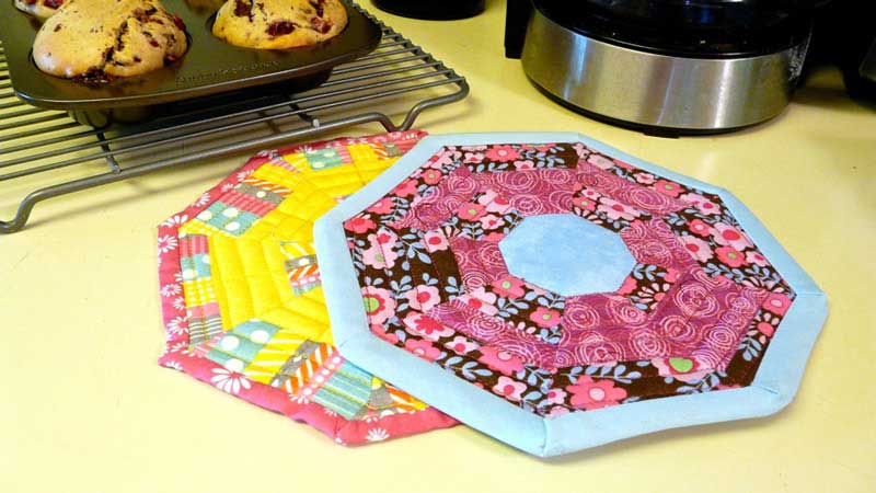
Compare the two photographs above. With the potholders placed on a plain surface, it may look nice, but it’s hard to imagine yourself doing anything with them. But place them in a kitchen with a hot pan of muffins nearby, and you’re reminded that these pretty objects are also useful, and that gives them more perceived value.
Extra details: Notice how little visual information is needed to communicate the setting — a countertop, and small sections of a coffeemaker and a baking pan. There’s no need to crowd the product out of the shot!
Trick #2: What is the product used with?
When someone uses your product, what other things might they need to have close at hand? A person who uses earbuds, for example, needs a phone, MP3 player, or computer to plug them into. Someone using a coaster needs a beverage to set on it. If you can identify a few things a typical buyer might be using alongside your product, you can stage these items in your photographs.
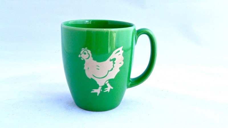
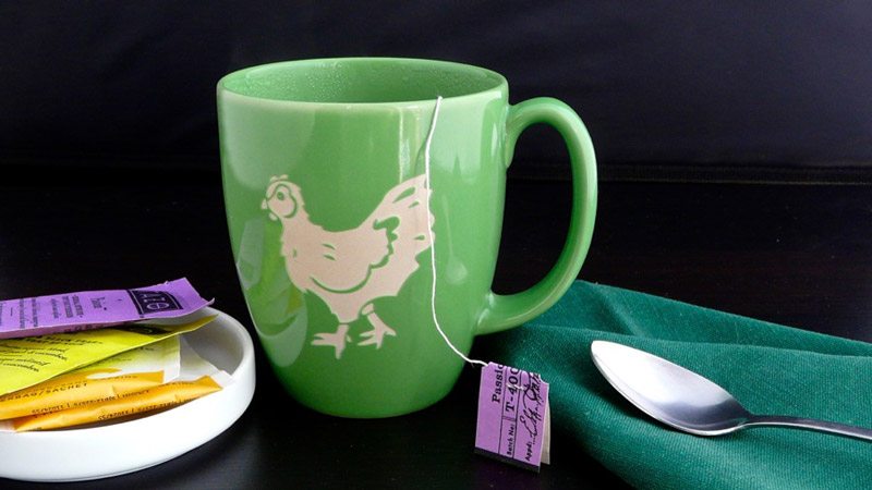
Again, compare the two images above. This coffee mug is nice but looks a bit sterile by itself. When it’s paired with some things you might use with it, suddenly the mug looks much more engaging. The simple props create a mood that the viewer can inhabit.
Extra details: Notice how the colors of these extra items are all related to the color of the mug, so they don’t distract from it. And see how the mug is the tallest item in the shot, so it’s most prominent? When you add props, it’s important to keep the product at center stage.
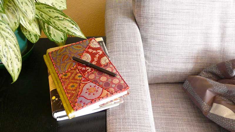
Trick #3: Shooting from a “human angle”
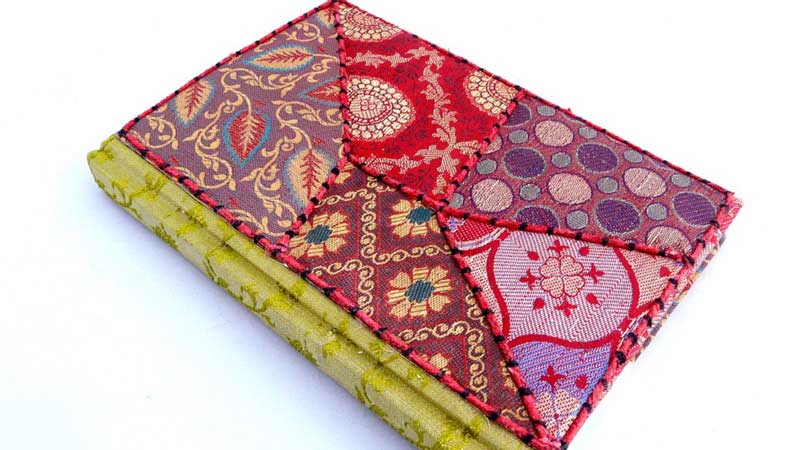
You can also create an illusion of human presence in a product shot by simply framing your shot so that it could include a human. Compare the two shots above. In the first shot, the journal is attractive, but since no person can fit in this tightly framed space, it’s easy to feel a bit distanced from the product. In the second shot, the same journal is shown in a comfortable, human-scale environment, and suddenly you have a sense of how this journal might fit into your own life.
Extra details: Notice how the journal is the most brightly colored object in this shot, so it retains its prominence among all these objects. This set-up also gives the impression that someone was just curled up on the sofa writing, but stepped away just before the shot was taken. When you view this shot, can you imagine yourself stepping into their place?
Try these tricks in your next product photo shoot, and see if the products get more attention as a result.
Interested in taking your photography to the next level? Try a photography course with NYIP.


